2018 | CASE STUDY

Redefining a tech mogul’s branding and systems

What is The Verge?

The Verge is a technology new site that focuses on providing information on new tech releases. It’s sponsored by Vox Media and has several sister sites. One of which is Longform, which is a site dedicated to providing longer journal pieces on topics current in science, tech and culture.
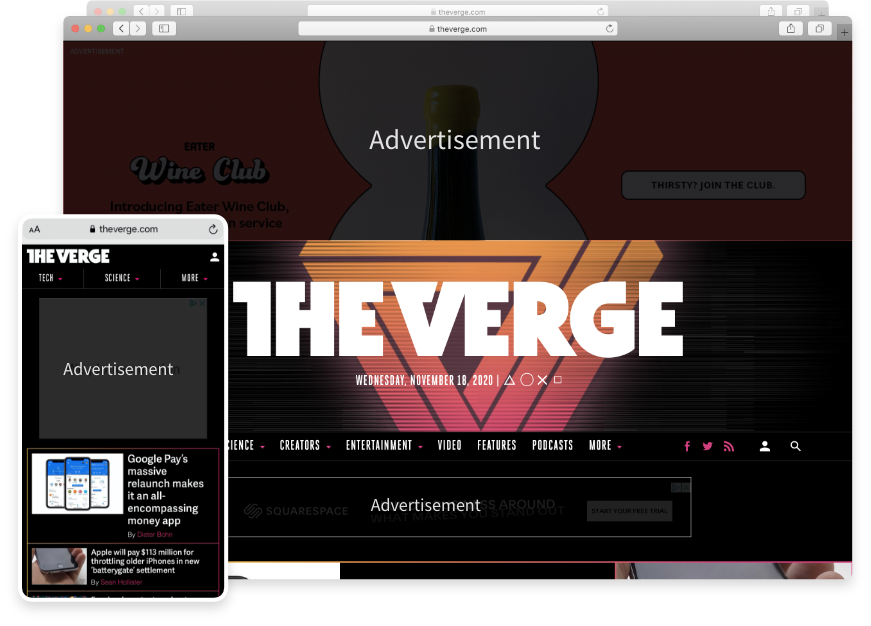
Screenshot of homepage (Nov. 2018)

Their target audience
The Verge’s current audience is predominantly male. They are looking to expand and attract more female readers. Their top demographic is 18-to-34-year-old males, who have a college education.
Identifying Pain Points

⚠️   Confusing navigation
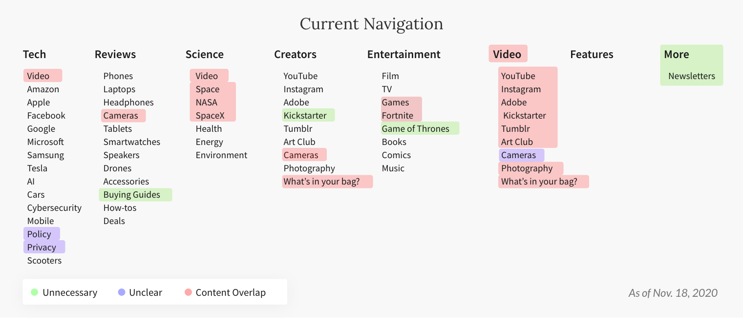
The navigation has overlaps in content, and is not easy to understand. Two of the dropdown’s first result is “Video”, however Video is its own tab in the navigation.
⚠️   Ads dominate the newsite
The first thing viewers see when opening the site is an ad that takes up 65% of the page.
⚠️   Right-aligned all-cap titles
All Capitals reduces readability of text, and is often perceived negatively. Readers would benefit if headers were to switch to sentence case or title case.

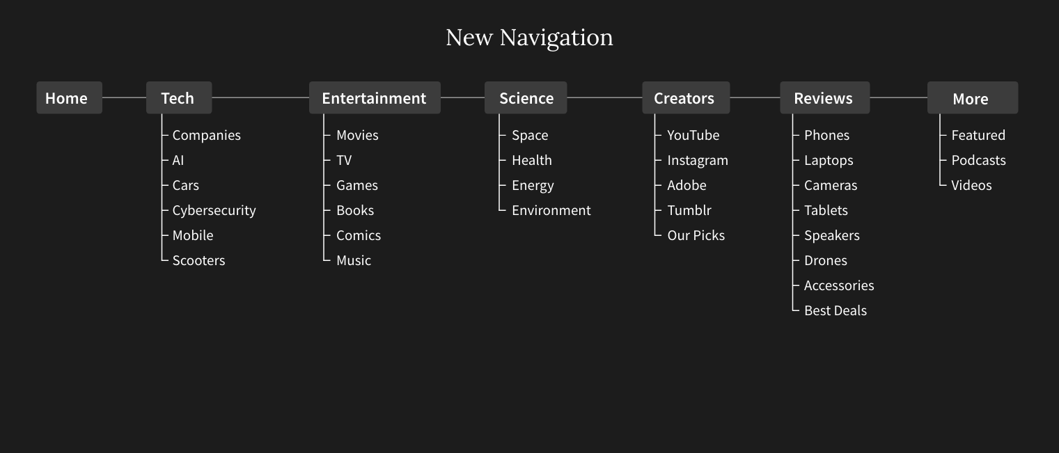
Rethinking Navigation

Brand Redefinition

Current Logo
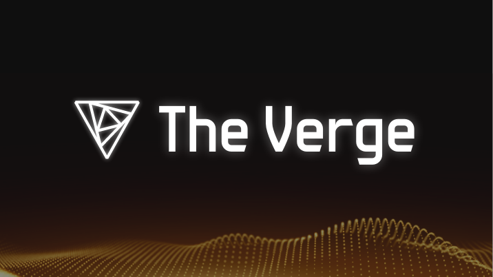
Redesigned Logo

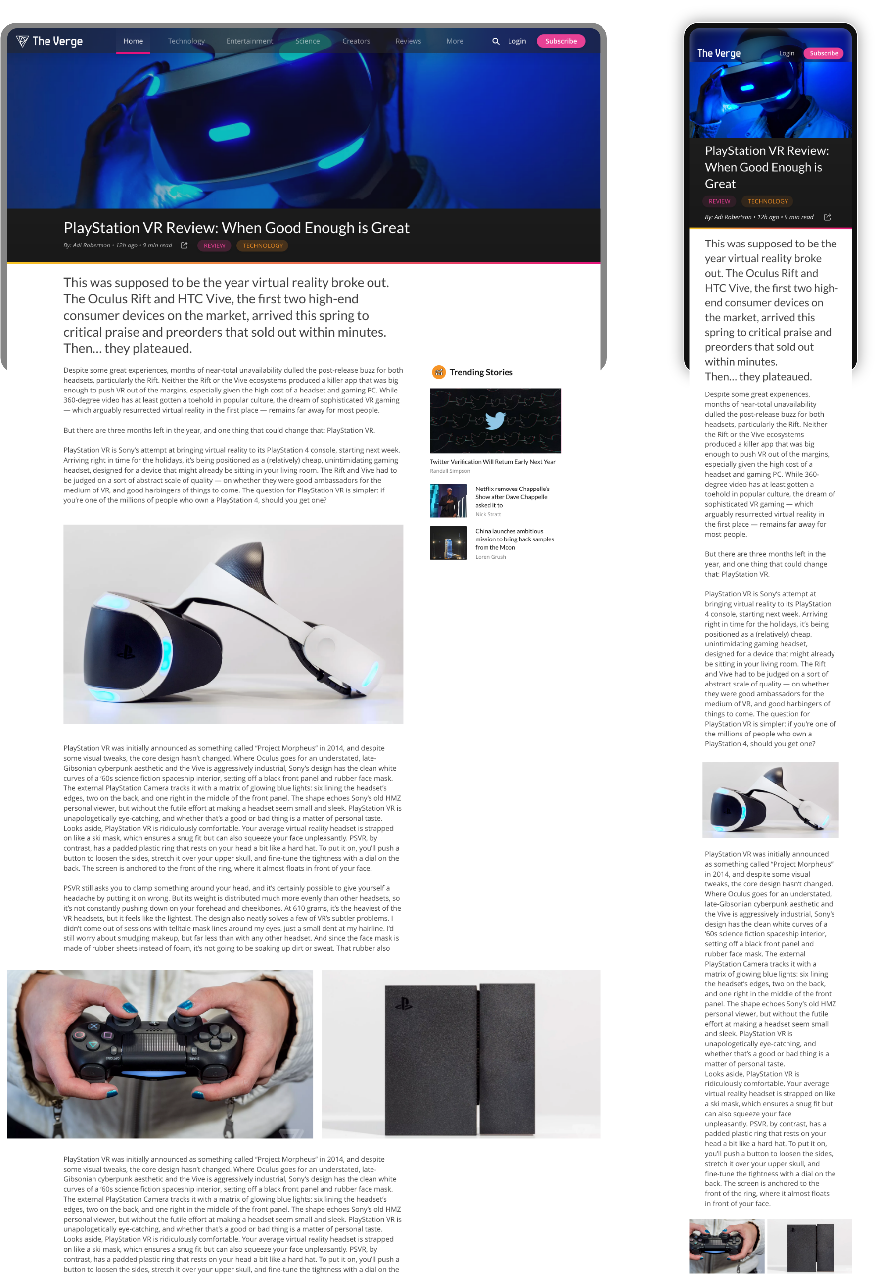
Interface Elements

Explore Stories

Navigate through the new redesign of the Verge by swiping through its top navigation bar. Find top trending stories on the home page or filter by categories like technology and science.

Thank you for viewing!

Next Project →